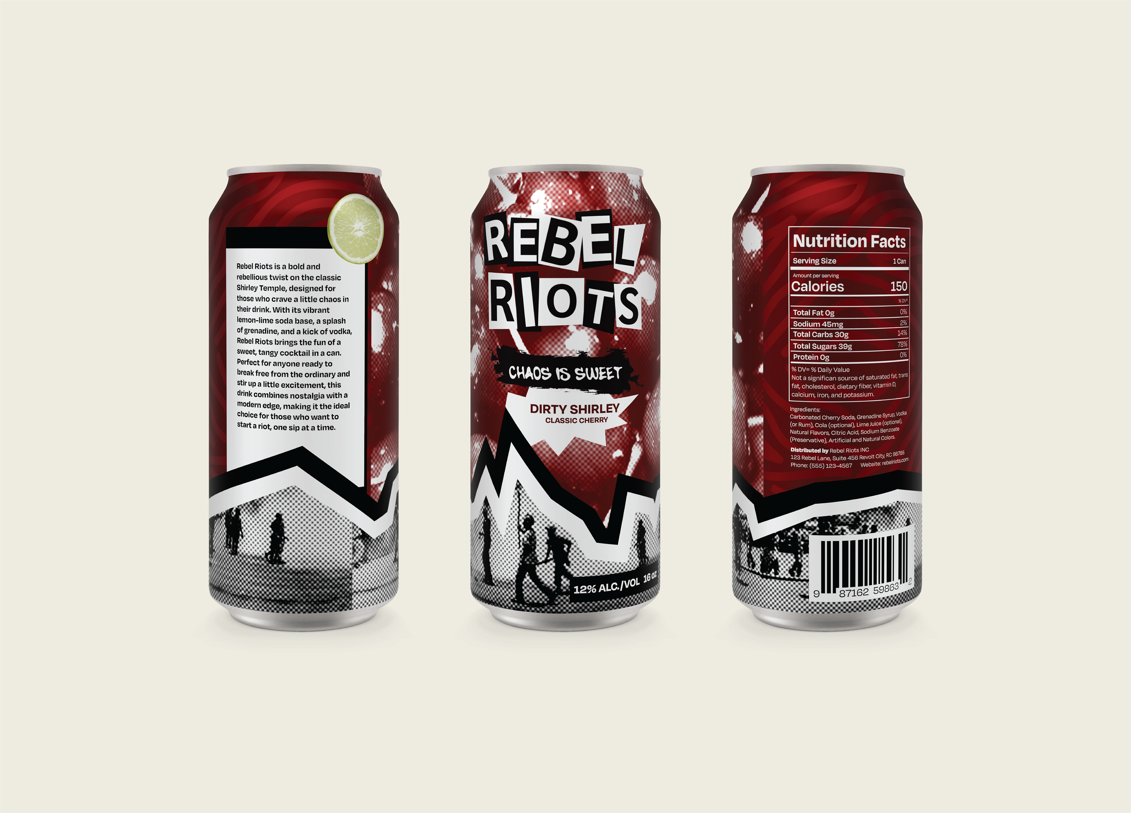
Objective
The Rebel Riots project aimed to build a packaging system and a branding identity for a Dirty Shirley cocktail in a can that redefines the classic Shirley Temple.
Approach
This project intended to create a well-developed packaging system and identity for a canned cocktail brand called Rebel Riots. The inspiration for this brand is based on the rebellious twist on the classic Shirley Temple. The design brings a punk rock edge to the beloved drink, channeling the chaos of the night into the palm of your hand. The approach focused on bold, high-contrast graphics and gritty textures to evoke the raw, energetic vibe of underground culture. Along with the layered imagery and an angular, bold lines that were used to amplify the brand’s disruptive personality and make it stand out on the shelf.