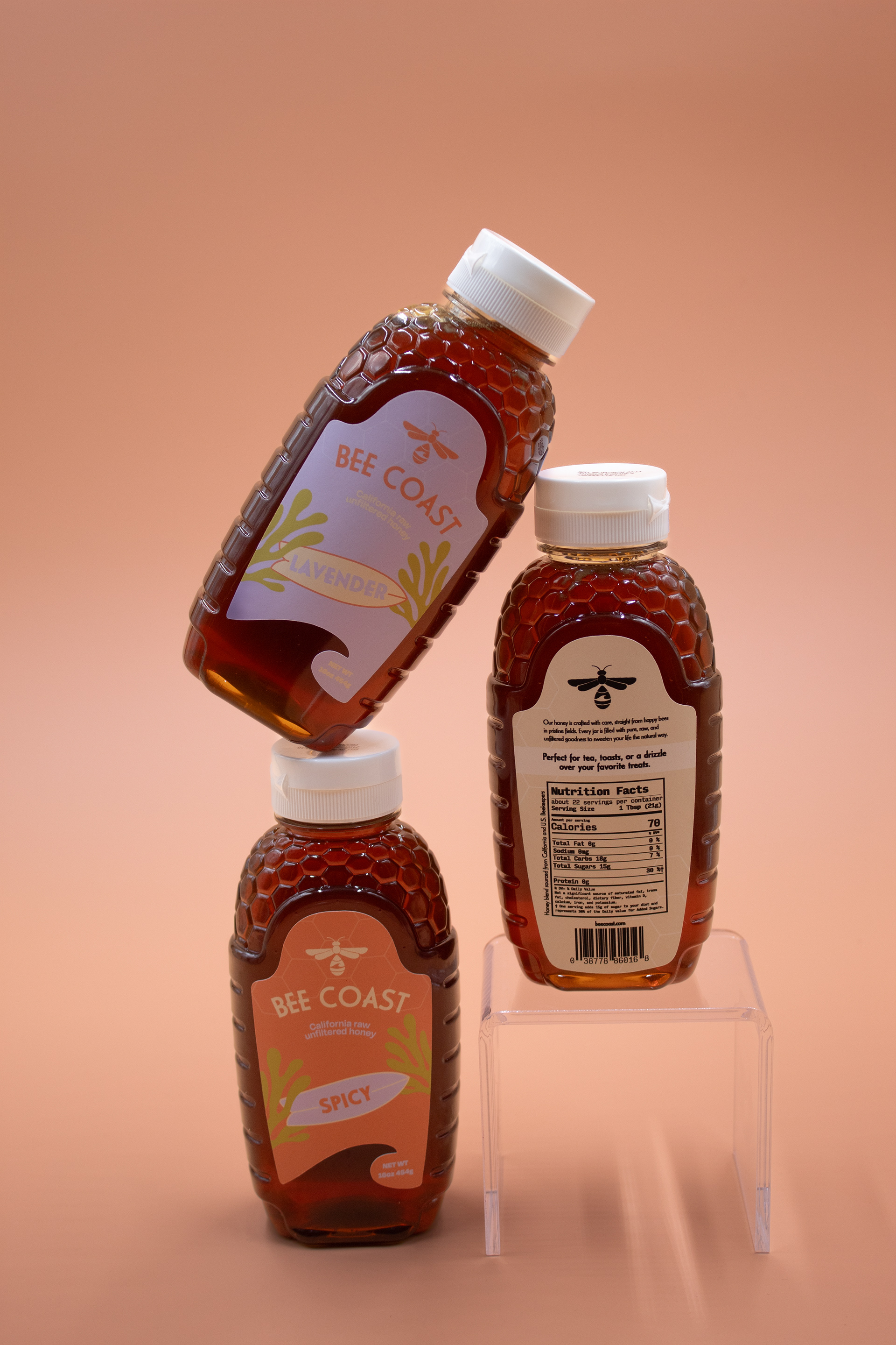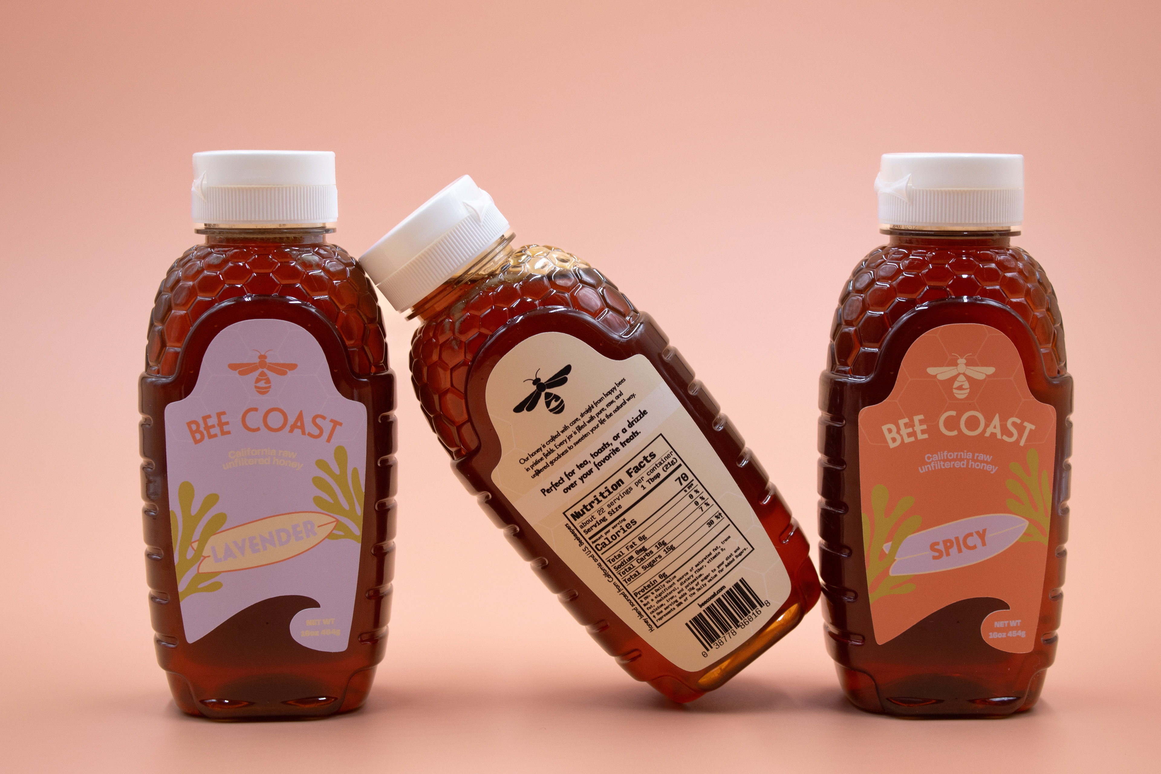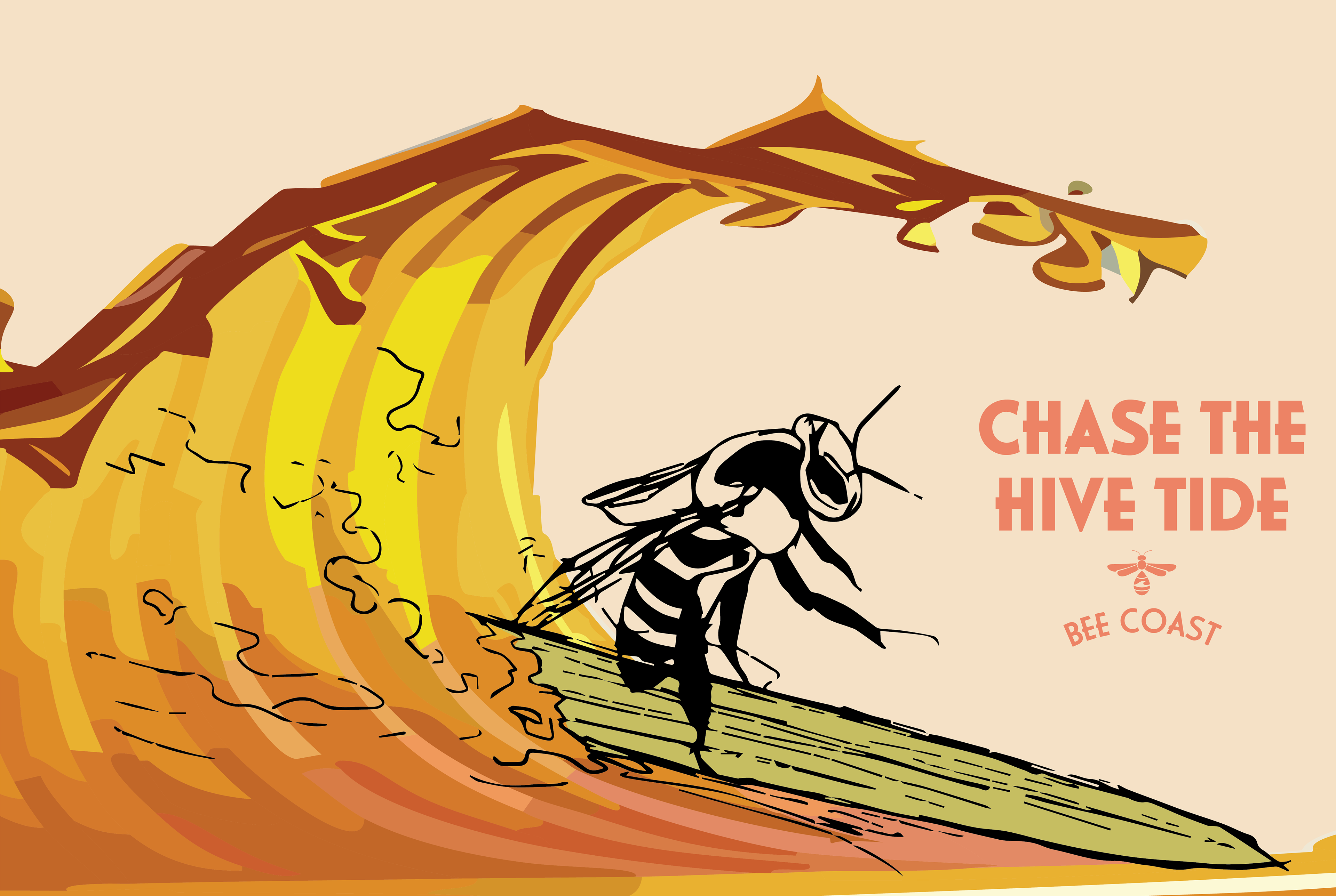
Objective
The Bee Coast project required creating a packaging system as well as an developed identity for a honey brand that combines natural flavors with coastal charm.
Approach
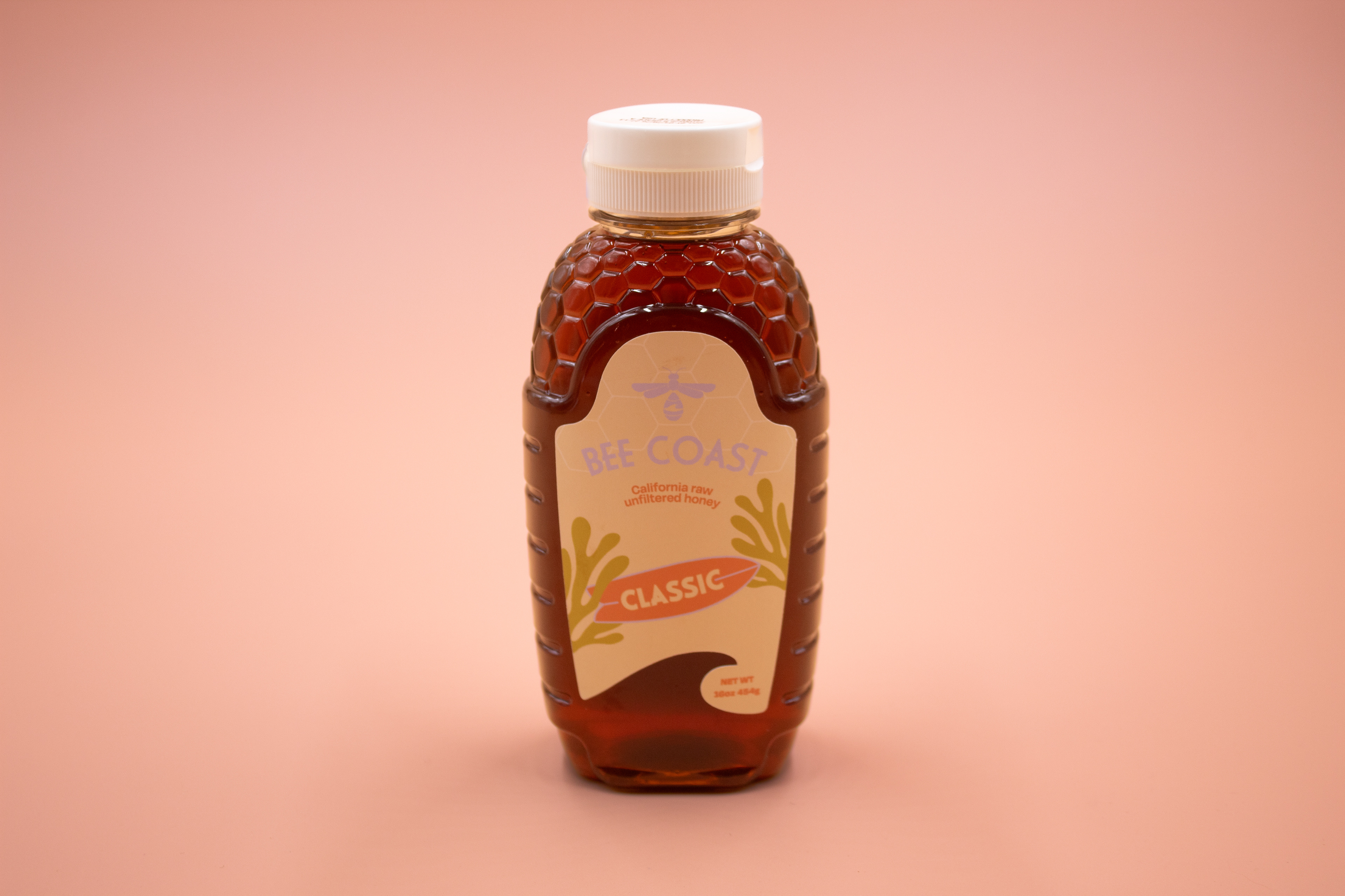
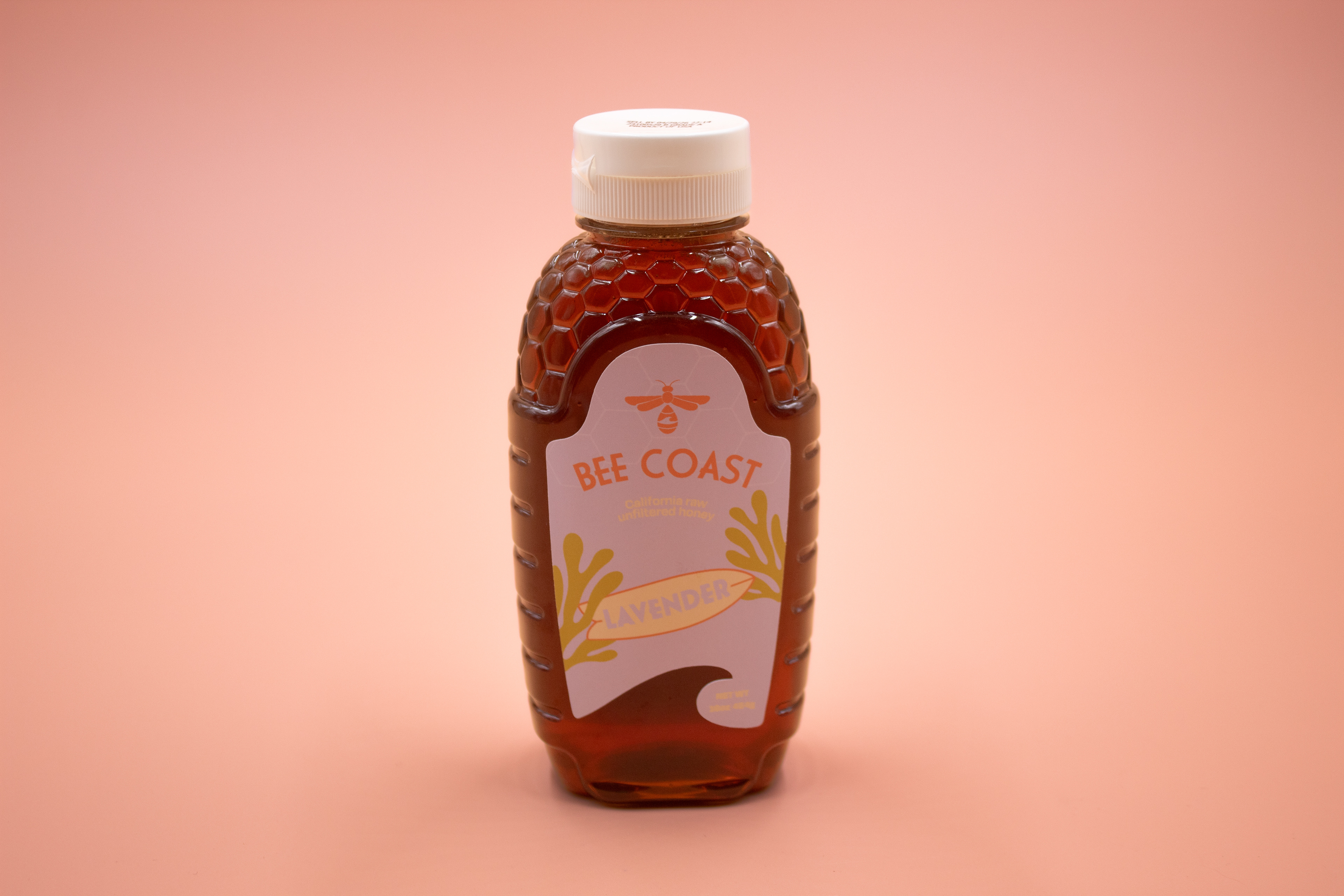
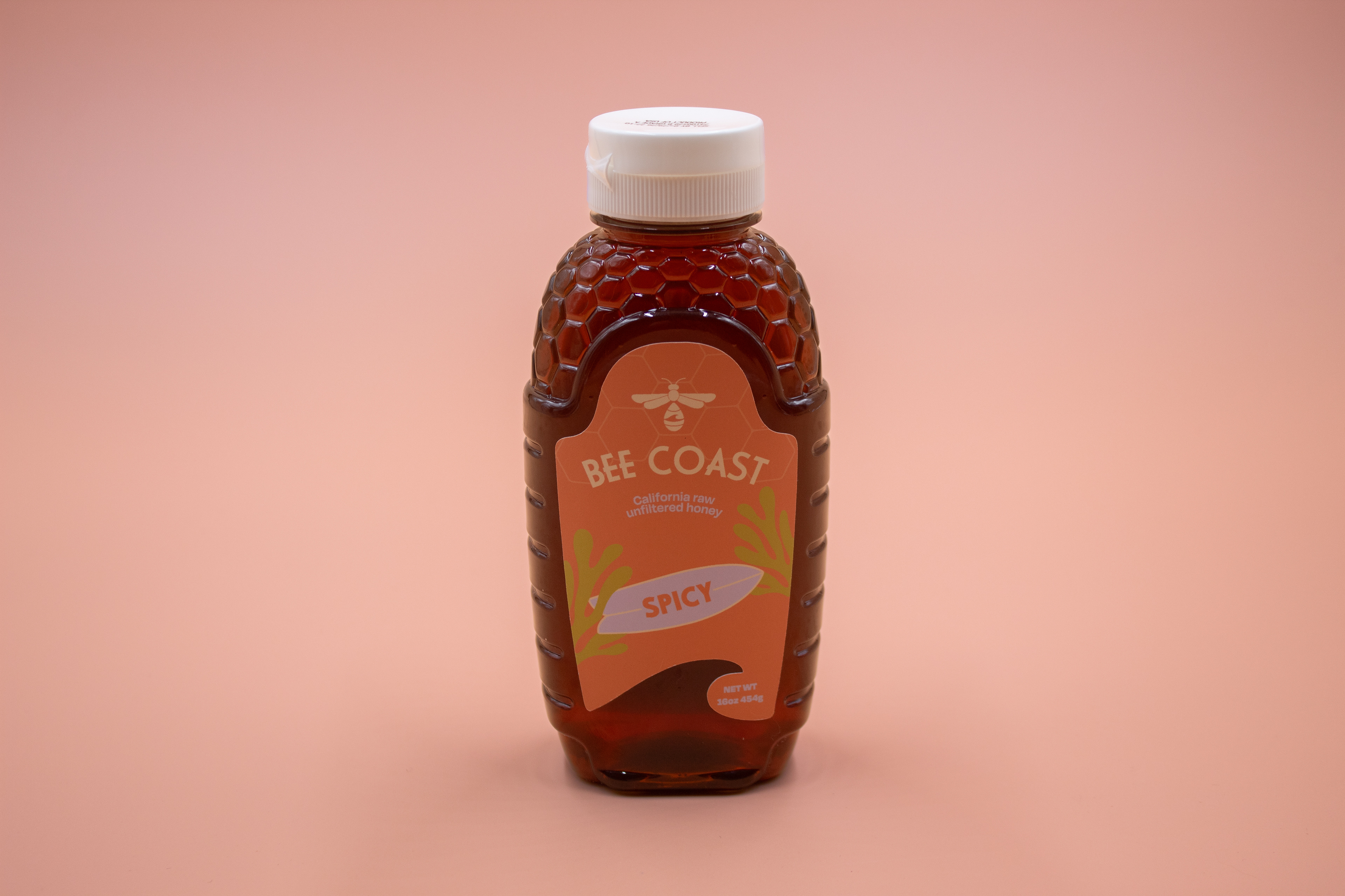
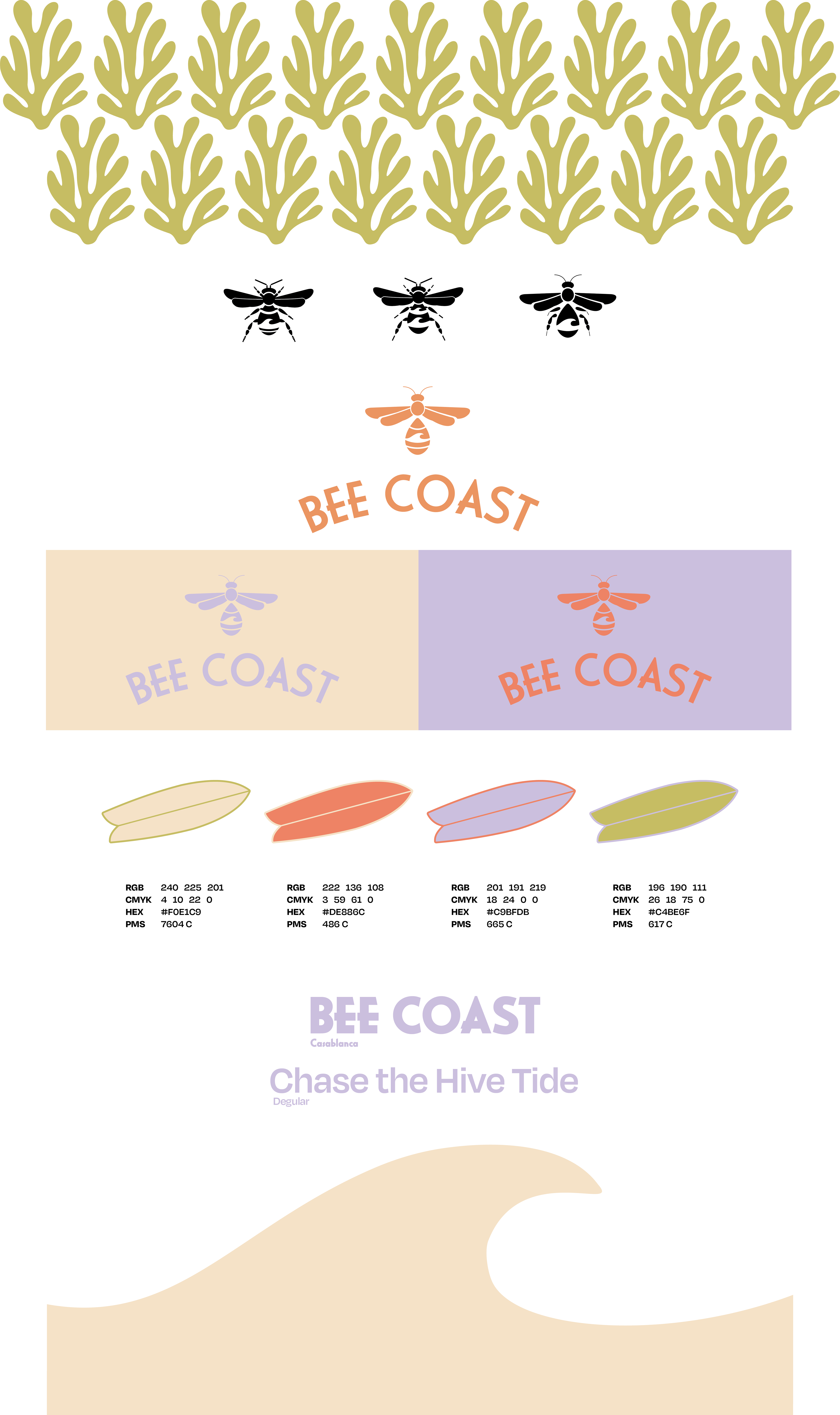
The Bee Coast project aimed to develop a full branding system with an emphasis on packaging design that reflects the natural, artisanal quality of this honey. The approach centered around capturing the essence of coastal beekeeping—sunny, organic, and approachable—through a visual identity that feels fresh, clean, and rooted in nature. A soft, earthy color palette paired with hand-drawn illustrations helped communicate the small-batch, handcrafted nature of the product. The typography and layout were chosen to balance rustic charm with clarity, creating a brand experience that feels both trustworthy and thoughtfully refined.